
New brand… same expertly curated medical education
June 4, 2024
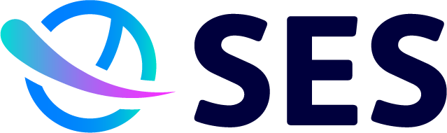
We’re so proud to unveil to you our new logo, branding, and website.
A true collaboration
After deciding it was time to give our branding some attention, our lead designer collaborated with colleagues from different departments to discuss who we are as a company – we know what we do best, and we need to ensure we convey that to our audience. These initial conversations helped us to pin down a brand identity. At our core was our dedication to delivering easily digestible independent medical education to enhance learning. We decided on two words that encompassed that: ‘streamlined discovery’.
We also loved the analogy that SES is like a sun that powers the hubs – little planets of information, one-stop-shops for disease updates. Graphic devices such as swooshes and circles helped to further convey our streamlined identity and themes of solar systems.
This collaborative approach provided the base to carve out our new look and feel. We’ve redesigned our logo, turning the old shield into a circle to better reflect our hubs and have a more planetary feel. We have introduced vibrant gradients based on the hot UV light spectrum that’s associated with the sun and to show our passion and flair for what we do.
All in all, a clean, professional, and exciting brand with clarity and energy will drive us forward in what we do, to ensure we look as professional as we are at SES.
Please enjoy browsing our new website and see for yourself just how far we’ve come, and how far we intend to go. We always welcome new support for our educational platforms, so please don’t hesitate to get in touch with our partnerships team to see how best we can collaborate together on continuing to deliver outstanding IME.
Visit our new website